Color and lighting are two of the most powerful tools photographers have. The real impact shows when you use them together. One of the easiest and most overlooked ways to do this is by playing with color temperature, or the “warmth” and “coolness” of your light.
What We Mean by Warm Light
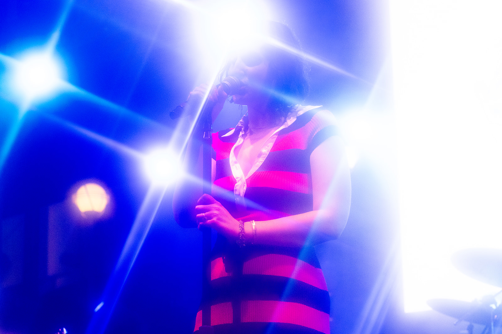
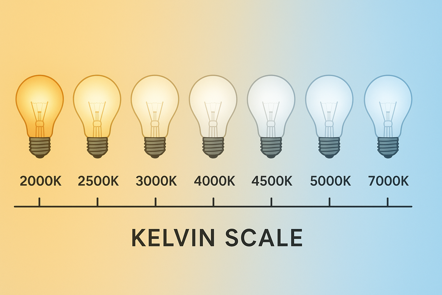
When photographers say “warm,” we’re usually talking about light with a color temperature around 3500K or lower on the Kelvin scale, or any colored light in the red, orange, or yellow range.
Warm light can feel cozy and inviting like late-day sunlight, but it can also carry high-energy emotions such as passion, excitement, or tension.
If you want your viewer to feel those things, reach for warm tones with your lighting.
What We Mean by Cool Light
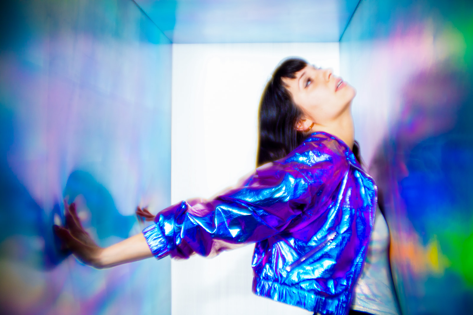
Cool light is 5000K and above, or colored light that leans blue, cyan, green, or violet. It often feels calm, quiet, and serene but it can also feel clinical or detached.
Use cool tones when you want to communicate calm, mystery, or a sense of distance.
Seeing the Difference
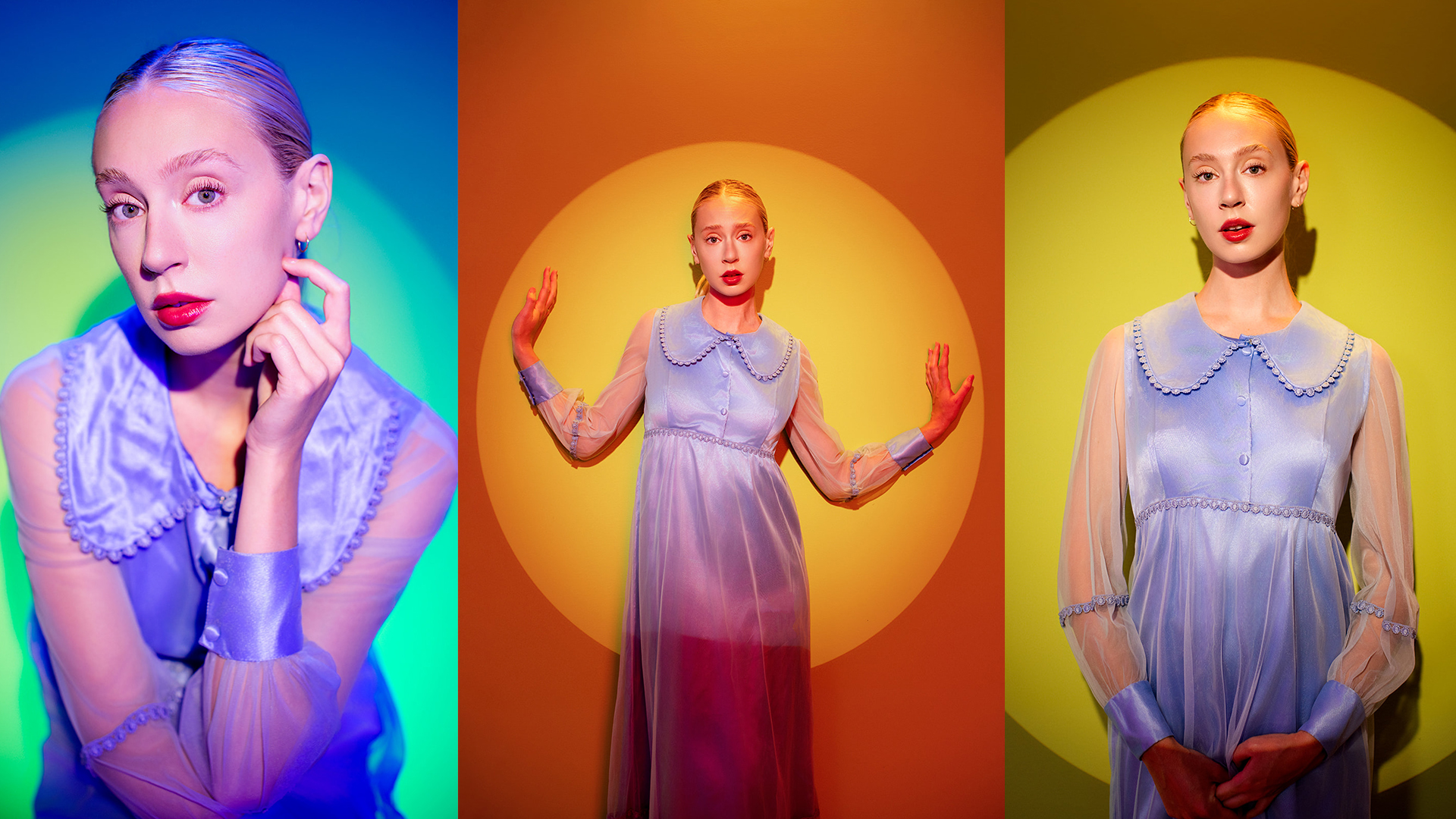
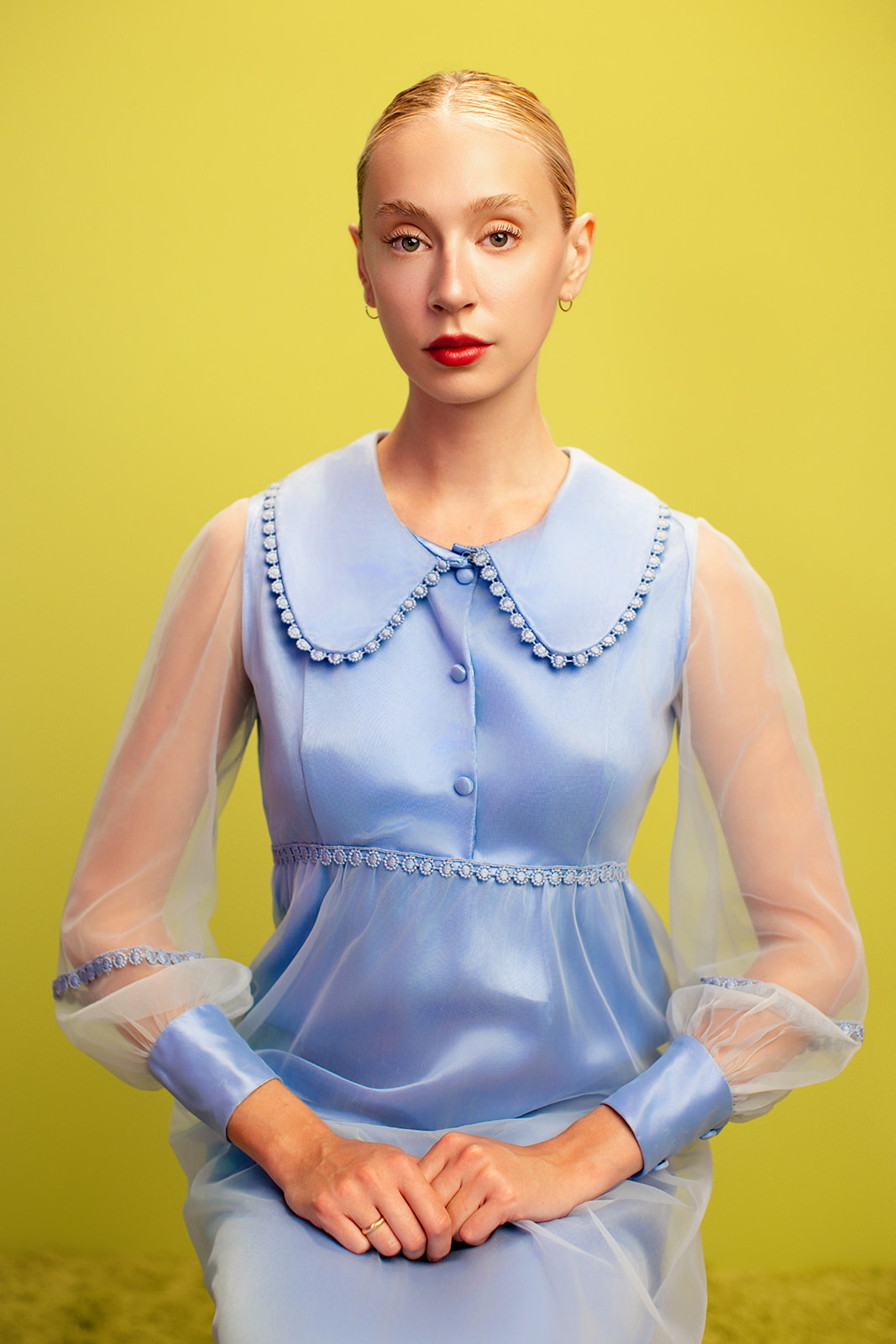
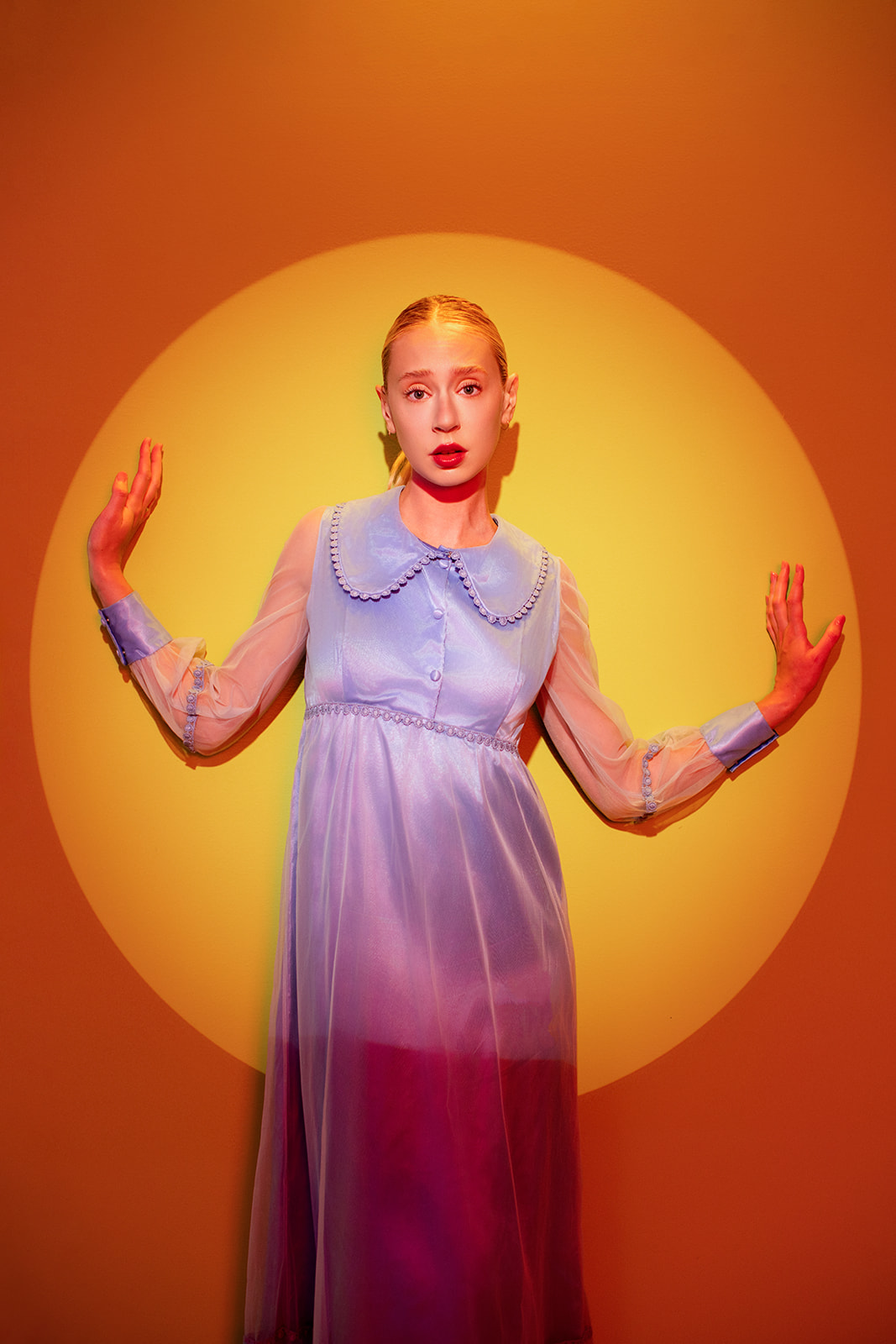
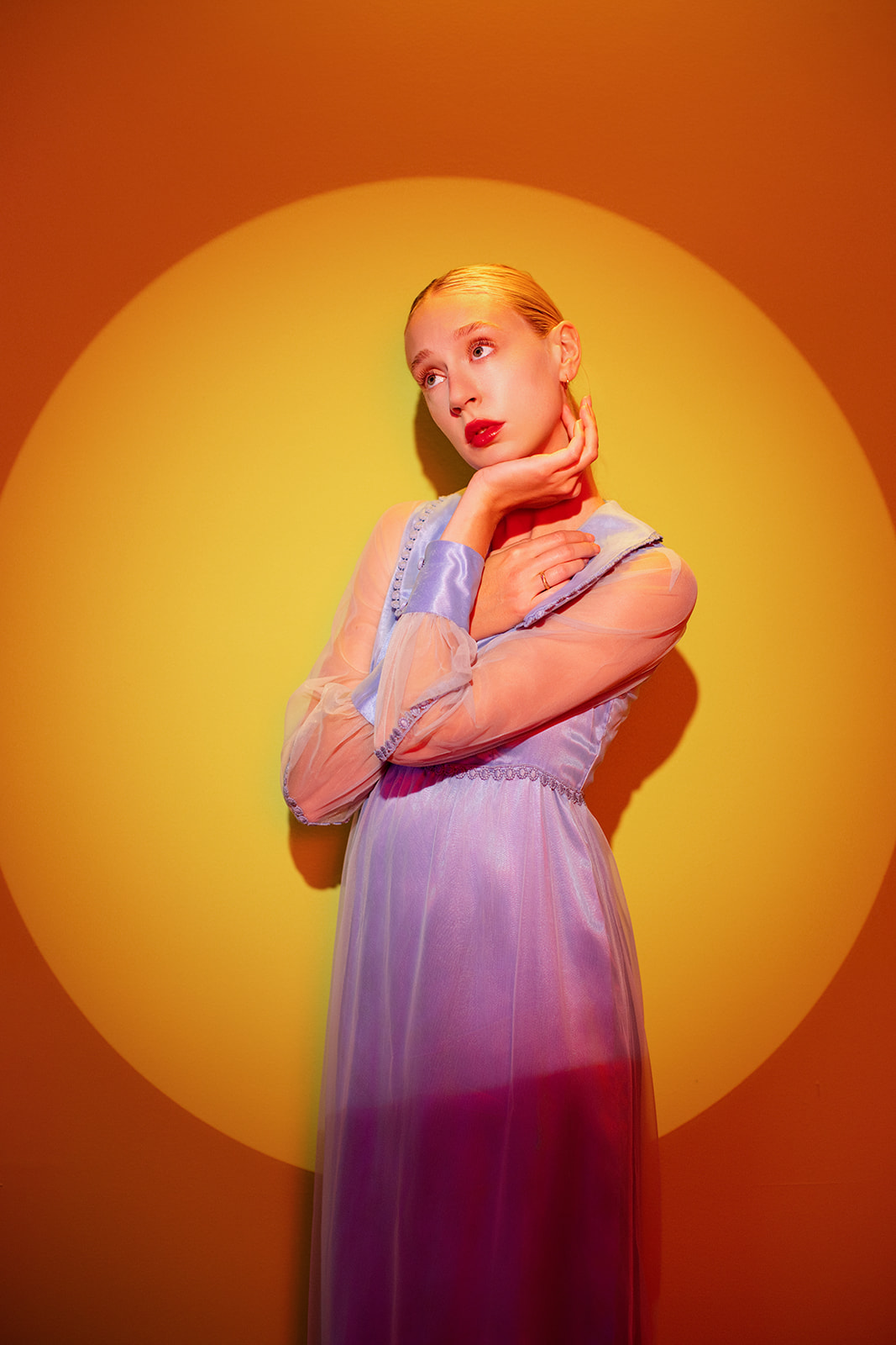
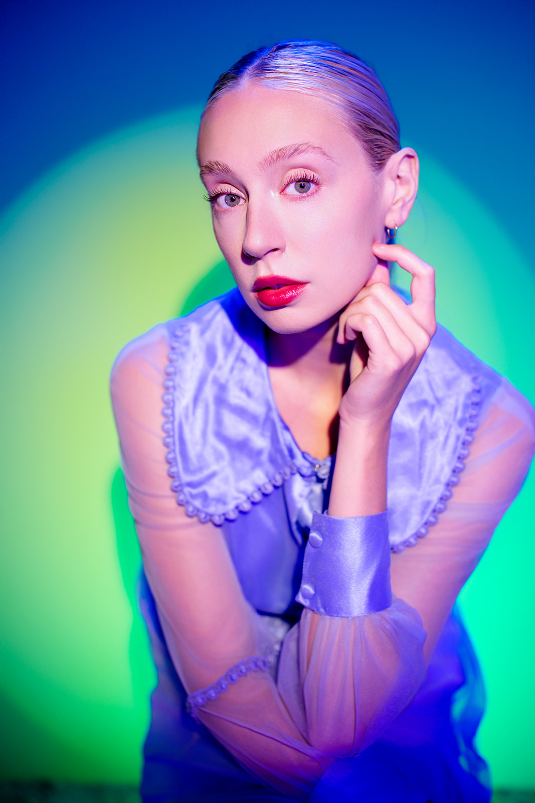
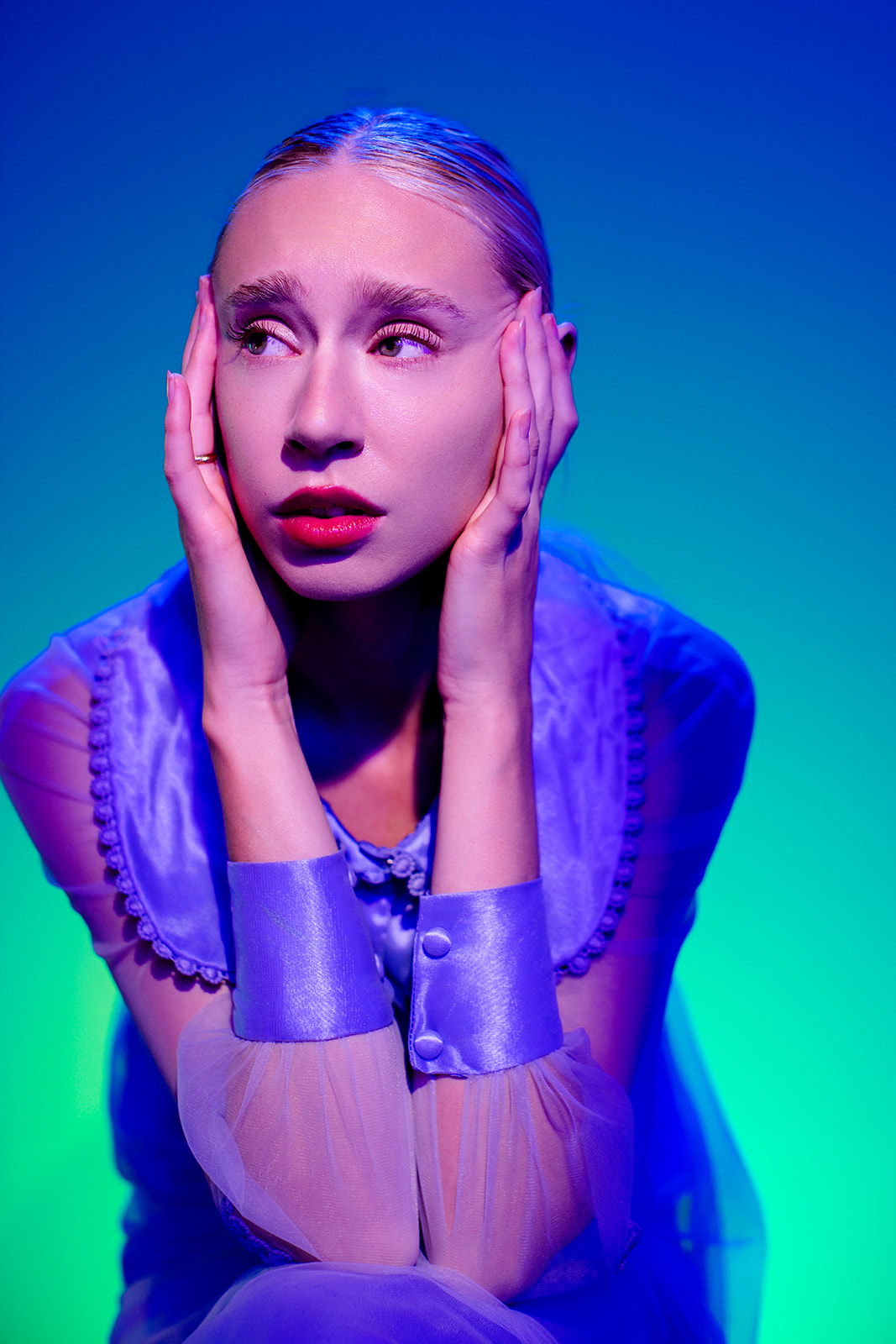
In one of our recent studio tests, we shot the same simple portrait with both warm and cool light on a yellow-green backdrop. I chose that backdrop on purpose because green is analogous to both orange and blue, so the background naturally worked with each lighting setup.
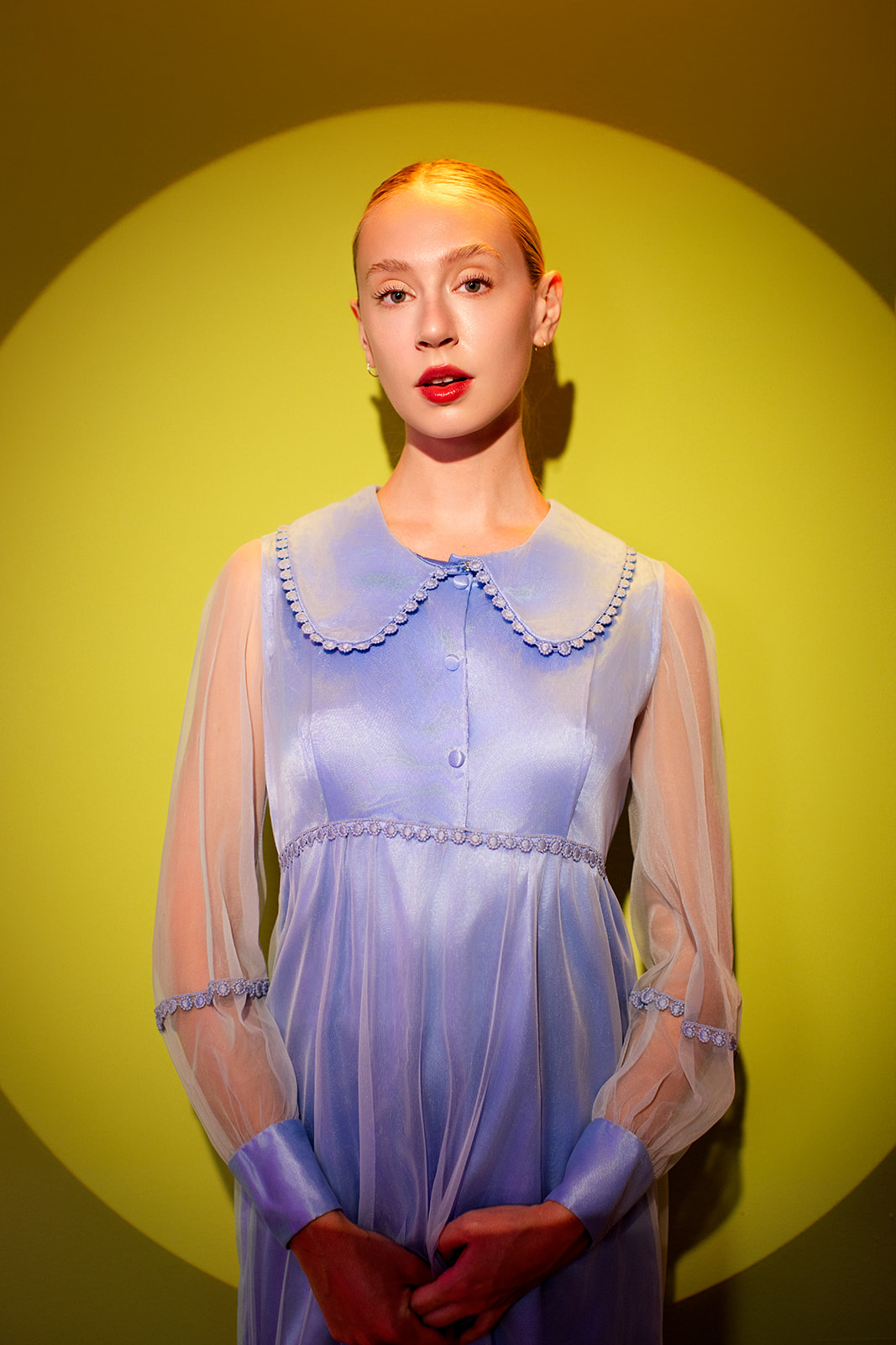
With warm, orange-yellow light, the photo feels charged and intense, almost anxious.
With the cool, blue light, the mood flips. It feels quieter and a little lonely, with a subtle sense of melancholy.
Put those images side by side and the emotional shift is unmistakable.

Mixing Warm and Cool
You don’t have to choose just one. Try blending warm and cool light, like red with blue, to create purples and magentas. The gradient adds depth and balance while keeping a surreal, cinematic vibe.
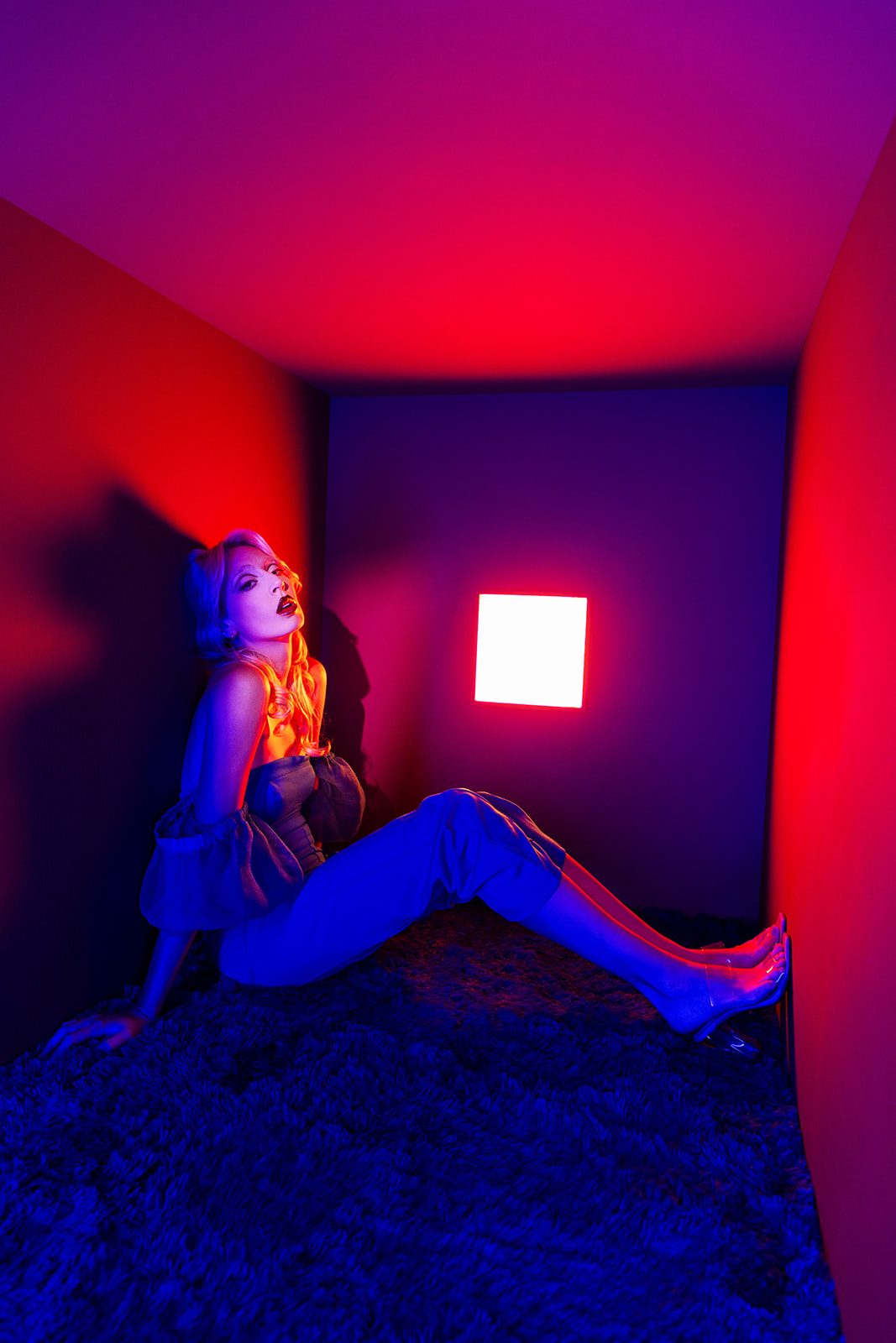
Color theory isn’t only about the color of your backdrop or the wardrobe you pick. It’s just as important in the light you use. Every time you adjust color temperature or add a gel, you’re shaping the story your photo tells.
If you want to dive deeper into how color drives emotion and learn practical ways to use it—whether you’re shooting outdoors, in the studio, or with mixed lighting—check out Color for Photographers: Using Color to Tell a Story, our ebook and mini course. It breaks down color theory into simple, photographer friendly steps so you can create images that grab attention and resonate.
.jpg)