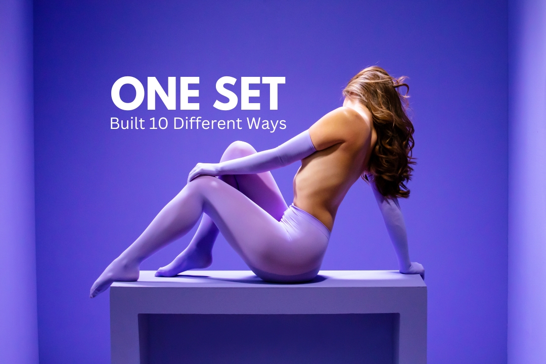

Color can be one of the most powerful tools in a photographer’s arsenal. Whether you’re just starting or have been shooting for a while, learning how to use color thoughtfully can elevate your work to a whole new level. In fact, it can be the secret ingredient that takes your photos from "cool" to something that really resonates emotionally with people.
Why Color Matters
Color isn’t just about making things look pretty. It plays a huge role in storytelling, setting the mood, and creating a connection with the viewer. If you’ve ever watched a Wes Anderson film, you know exactly what I mean. His use of color is next-level, creating visual harmony and adding layers to the narrative.
For photographers, color is often the first thing people notice in an image. Whether you're staging a whole set or capturing an everyday moment, thinking about color can help you build depth in your shot and bring out specific emotions.
Using Color in Subtle Ways
Even if you're not a set designer or painter, you can still be mindful of color. There are small but impactful ways to introduce it into your work:
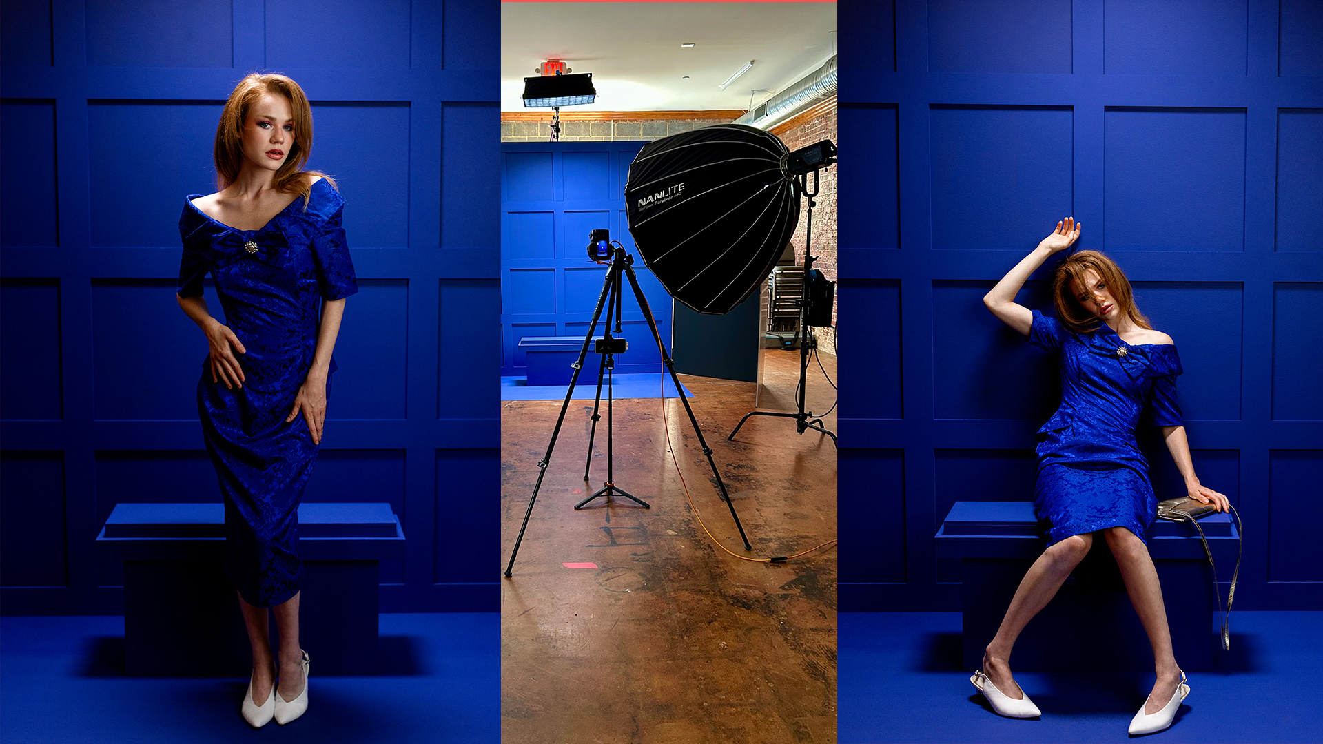
- Wardrobe: Think about how the colors your subjects are wearing complement or contrast with the setting.
- Makeup: Even something as simple as lipstick or eyeshadow can bring out specific feelings in a shot.
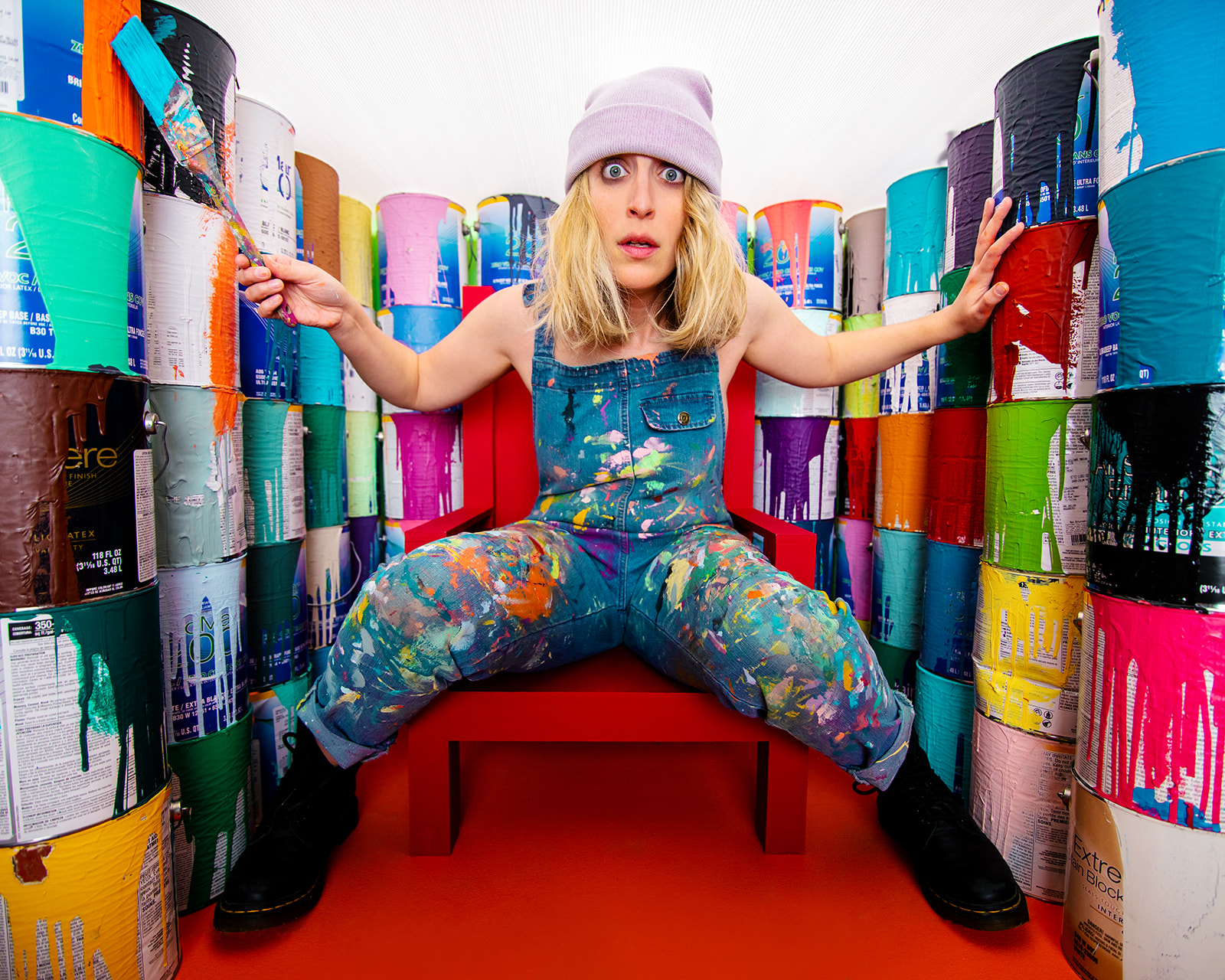
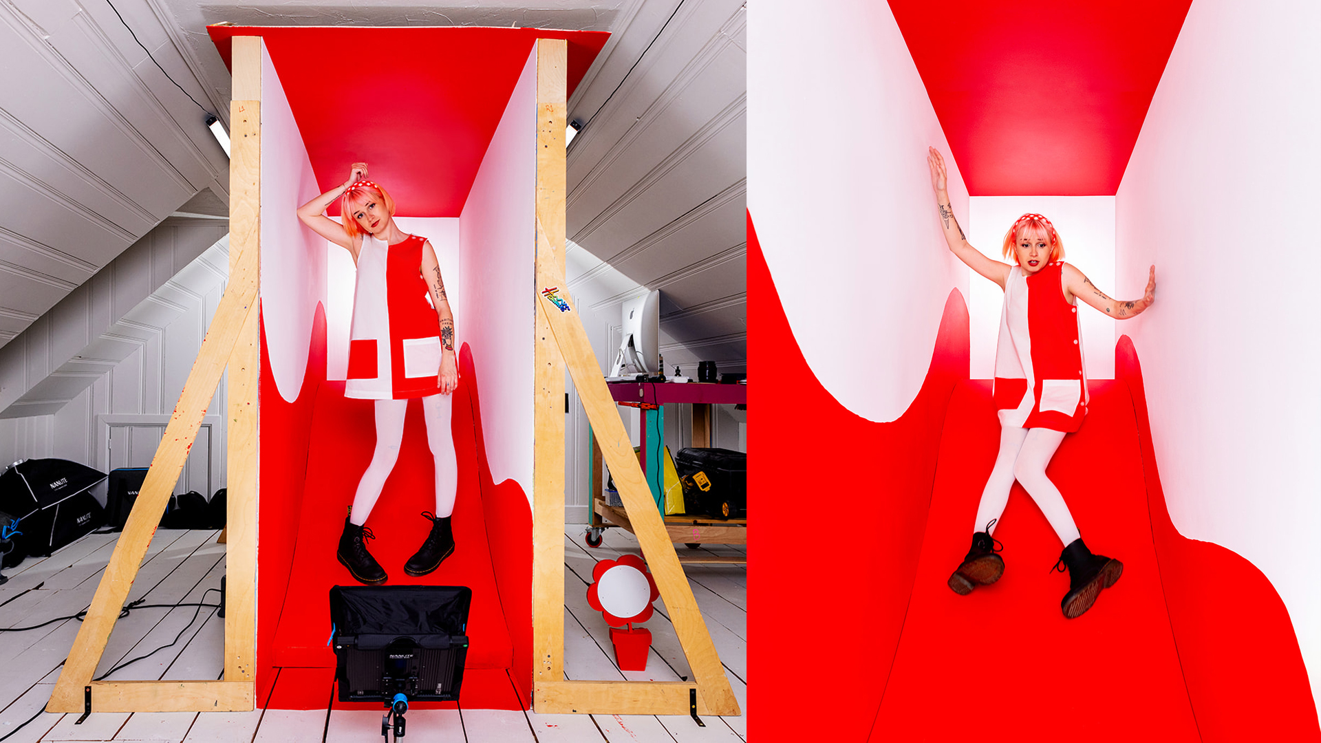
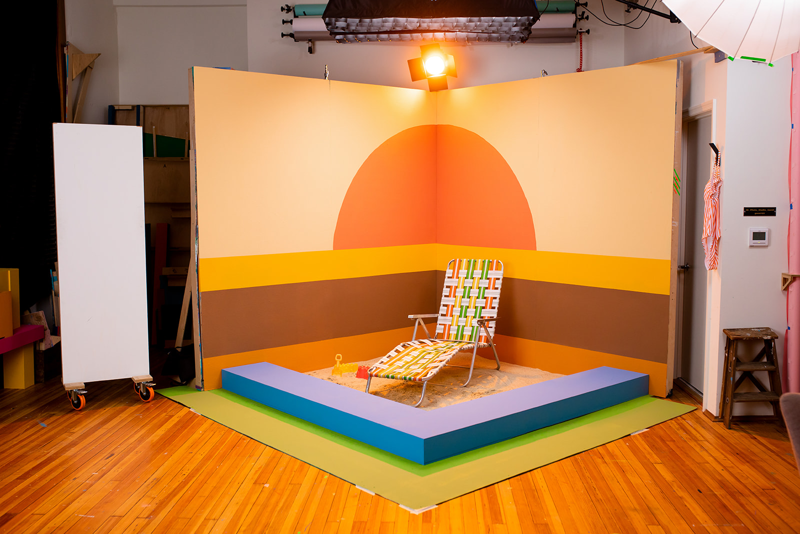
- Props: Try painting props or backgrounds a specific color to create a more stylized aesthetic.
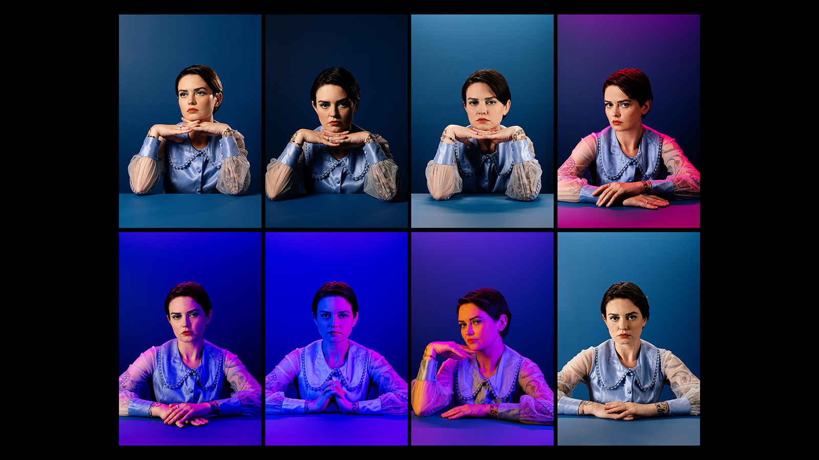
- Lighting: Colored gels or filters can change the vibe completely. For example, a warm orange can make an image feel cozy, while cool blue lighting can evoke a sense of detachment
Play Around with Color
Don’t be afraid to experiment! You might have a natural inclination toward certain color combinations, and that’s great. Follow your instincts, but also push yourself to try things outside of your comfort zone. There's no one “right” way to use color. What matters is that it works for your vision and enhances the emotion and narrative you're trying to convey.
That said, there is a bit of science to it.
Understanding Color Theory
Color theory is all about how colors interact and work together to create different effects. The basic tool here is the color wheel, which helps break down the relationships between different colors.

Here’s a quick crash course:
- Primary Colors: Red, blue, and yellow—these are your foundation colors.
- Secondary Colors: Green, orange, and purple, created by mixing the primary colors.
- Tertiary Colors: A mix of a primary and secondary color, like red-orange or blue-green.
Using Color in Your Photography
Once you have a handle on the basics, you can start applying some tried-and-true methods to create harmony or tension in your shots.
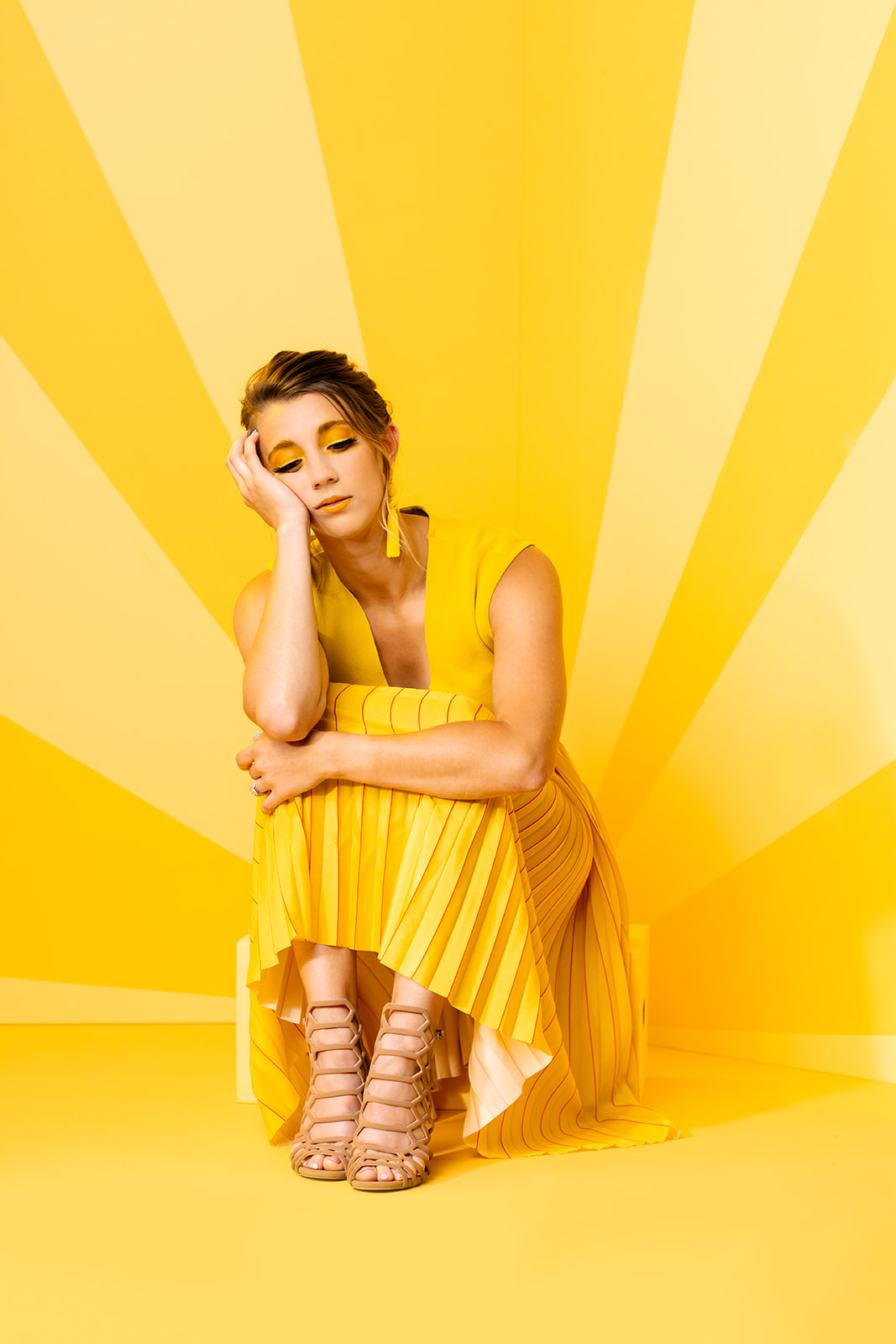
- Monochromatic: This involves using one color in different shades, which can create a cohesive, calming look. For example, using all yellow tones can feel energetic, but pairing that with a somber expression from your model adds visual contrast.

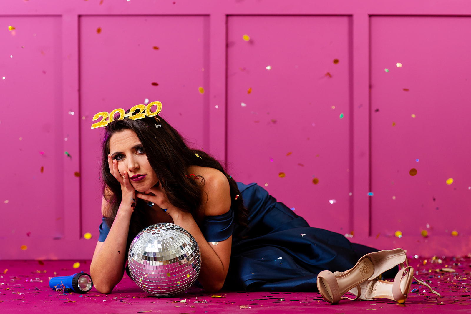
- Analogous: These are colors that sit next to each other on the color wheel, like pink, purple, and red. They naturally create a harmonious look and are easy on the eyes.
.jpg)
- Complementary: These colors sit opposite each other on the color wheel, like blue and orange or red and green. The contrast between them really makes elements in your photo pop.

Color and Emotion
Color isn’t just about aesthetics—it’s about emotion. Certain colors can evoke very specific feelings in viewers, whether it’s happiness, sadness, or even confusion. Here’s a breakdown of what different colors can communicate:
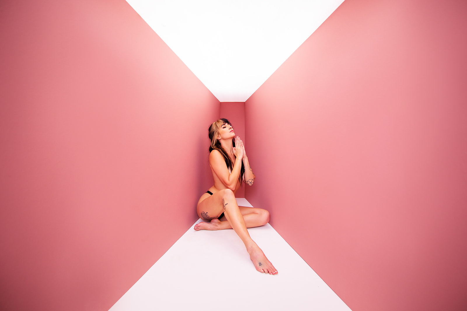
- Sadness: Blues and muted tones like grays and browns can really drive home feelings of melancholy and isolation.
- Happiness: Warm tones like coral, peach, and yellow create a feeling of warmth, joy, and optimism.
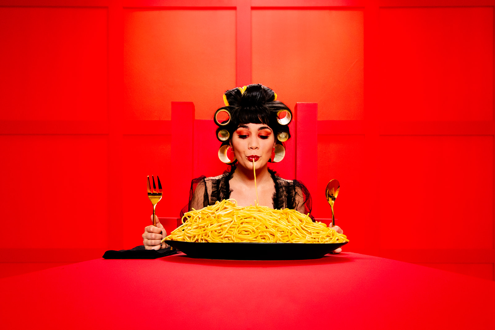
- Confidence: Bold colors like red and black make a strong statement and can convey power and authority.
- Fear: Dark colors, especially deep reds and blacks, evoke a sense of mystery, danger, and unease.
Using Color to Tell a Story
At the end of the day, your goal as a photographer is to make your viewer feel something. Color theory gives you a roadmap to do that more intentionally. Whether you're going for harmony or contrast, bright or muted tones, each choice you make helps shape the narrative and emotional depth of your image.
So, next time you’re planning a shoot, take a second to think about how color can amplify the mood or message you're going for. You don’t need to be a color theory expert—just trust your gut and keep experimenting.
.jpg)
If you want to learn more about how you can use color theory to create more impactful photos, check out our Online Color Course and our e-book Color For Photographers - I dive deeper into color theory and break down exactly how to use color to create more storytelling and emotional impact in your photos.
Category: Article

SUBSCRIBE TO OUR BLOG!
Post Tags
Color Theory Photography Photography Tips Color Theory For Photographers