Over the past year and a half, we have used a lot of paint - and I mean A LOT of paint. We use Sherwin Williams flat paint on all of our sets and have experimented with a very wide variety of their paint colors. Of course there are always colors I am naturally drawn to, but I also push myself to use colors that make me feel comfortable. Ironically, some of the colors that I originally just used to challenge myself with became my favorites.
So here we go! Here are my very favorite paint colors by Sherwin Williams.
Ravishing Coral
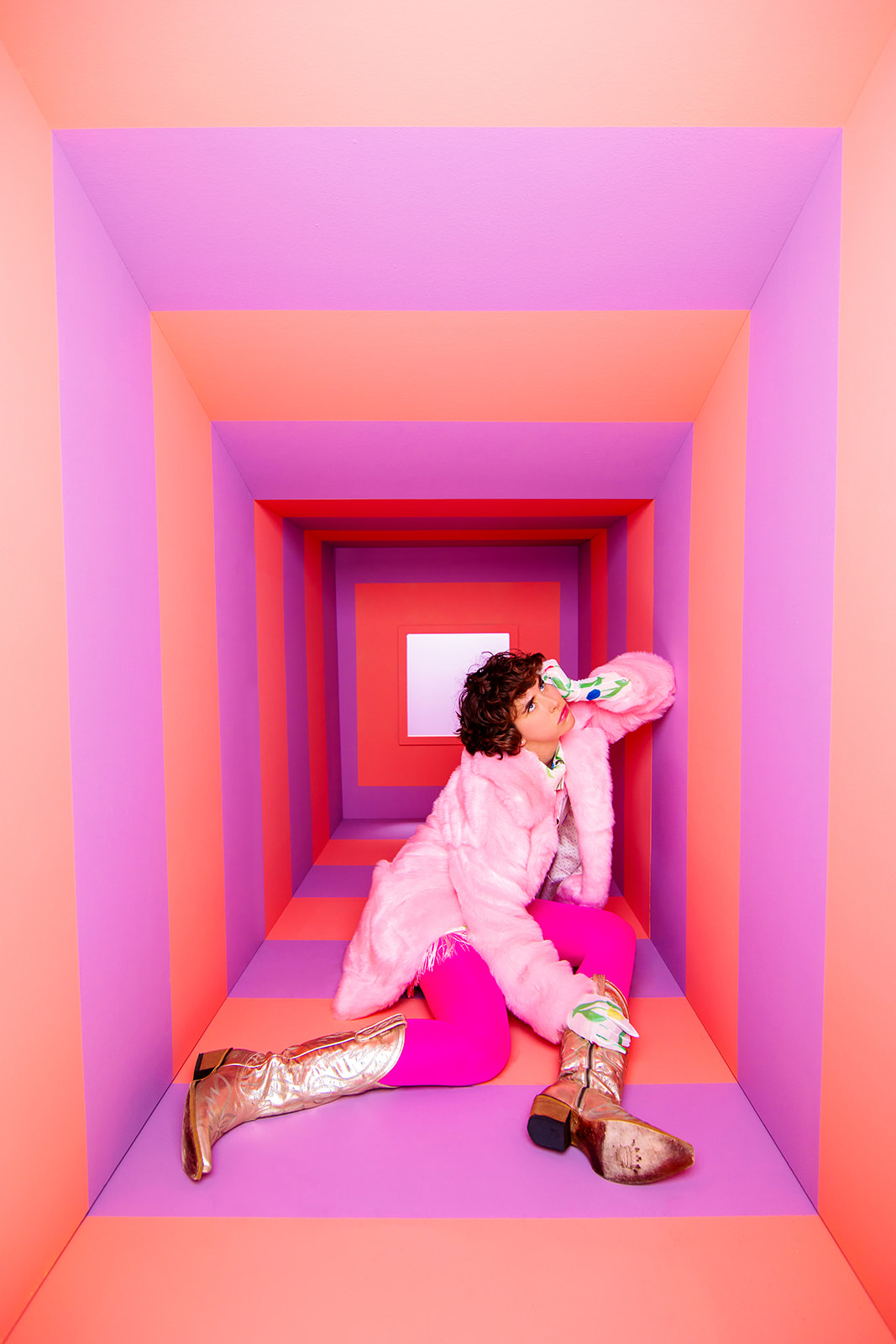
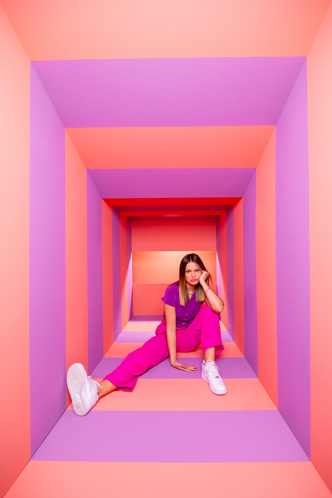
It's no secret that I love coral. It's the main color on our website. I love this shade because it's a beautiful balance of pink and orange. It's a touch on the muted side and depending on how you use ravishing color, it can add a pop of color or tone things down.
![]()

Frolic
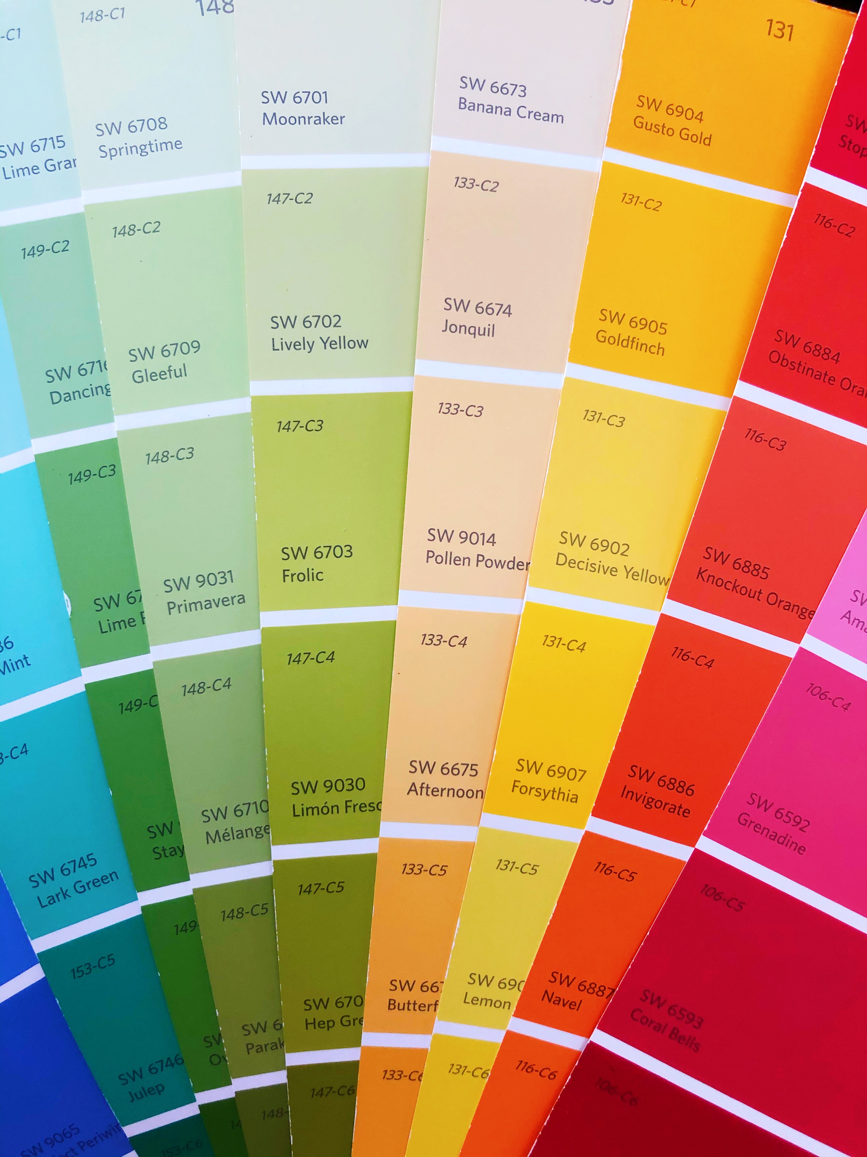
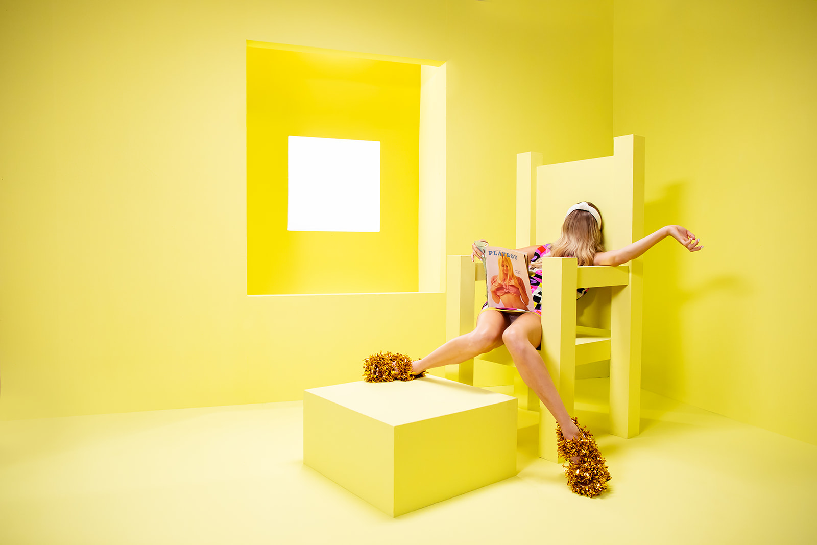
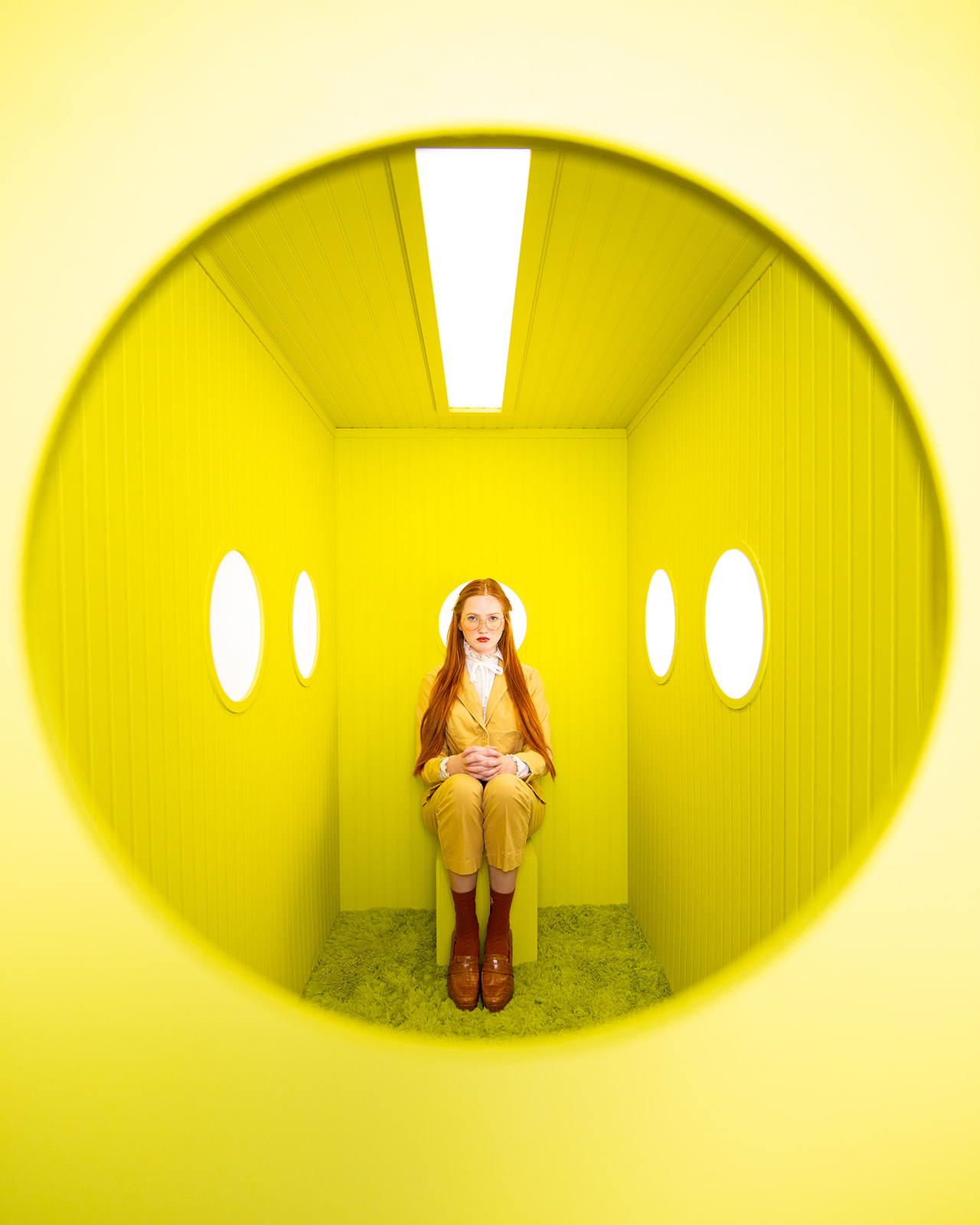
This is a color I first used to push myself because I didn't like it. Well the joke was on me because now I am obsessed. I think frolic may be my absolute favorite Sherwin Williams paint color. I love how tightly it walks the line between green and yellow. It gives me a warm citrusy vibe and makes me feel all warm and fuzzy inside.

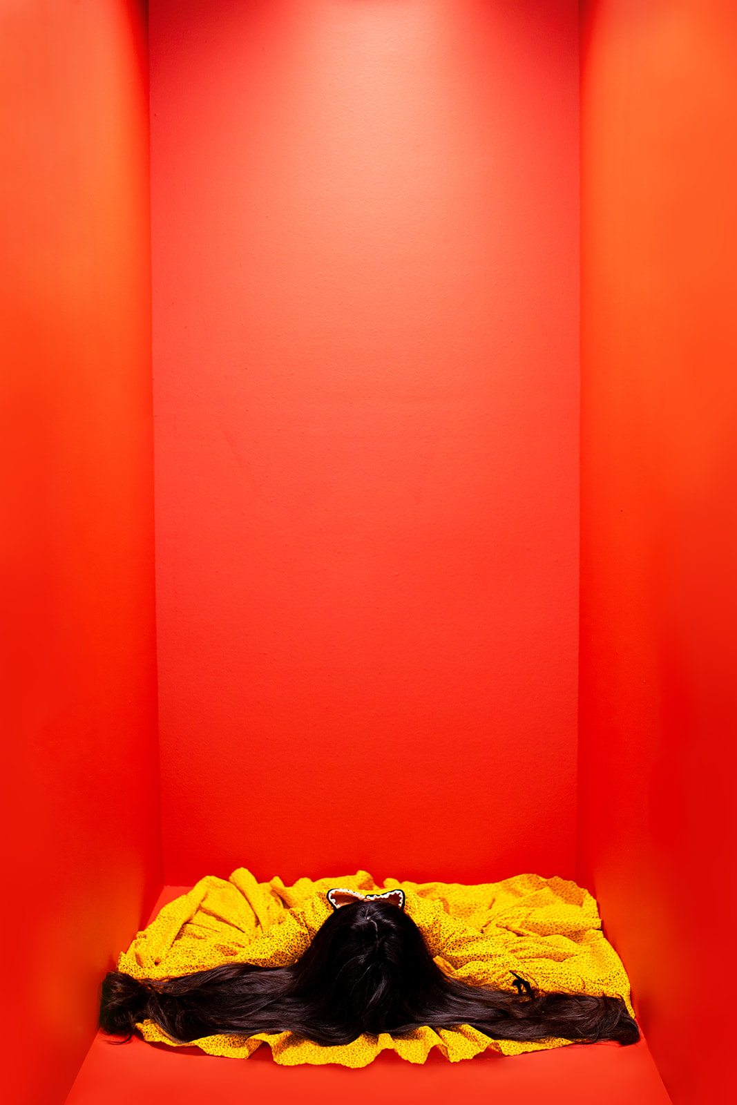
Real Red
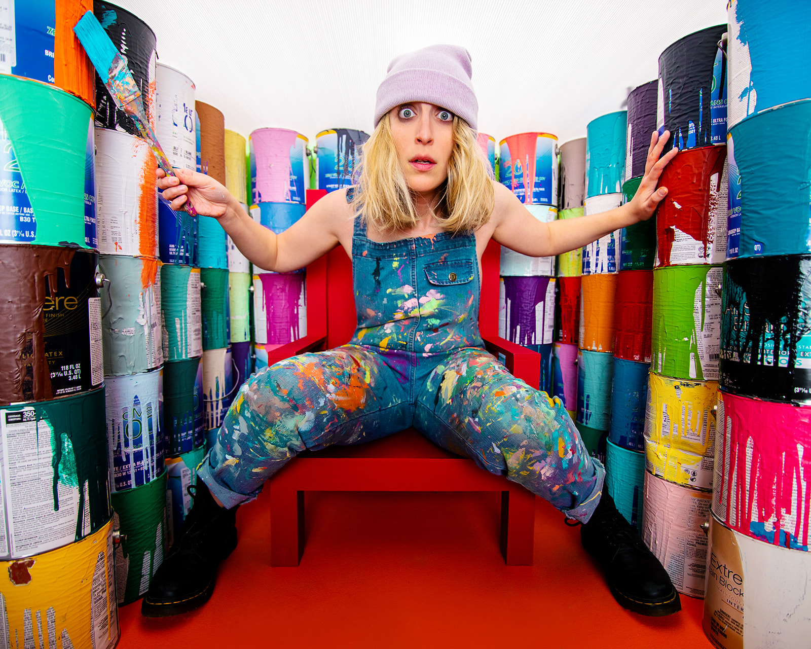
If I'm going for red, I want it to be in your face red. Real red gives me just that. It is aggressively red. I love the intensity it adds to a shoot.


Refresh
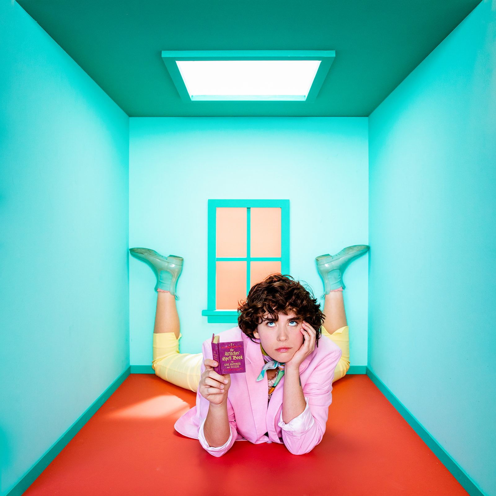
This color is equal parts exciting and calming. Refresh is a soft blue-green tone that can feel like a breath of fresh air. It works well when used as the primary color of a space or as an accent, but it's so pretty I usually go big when using this shade.
