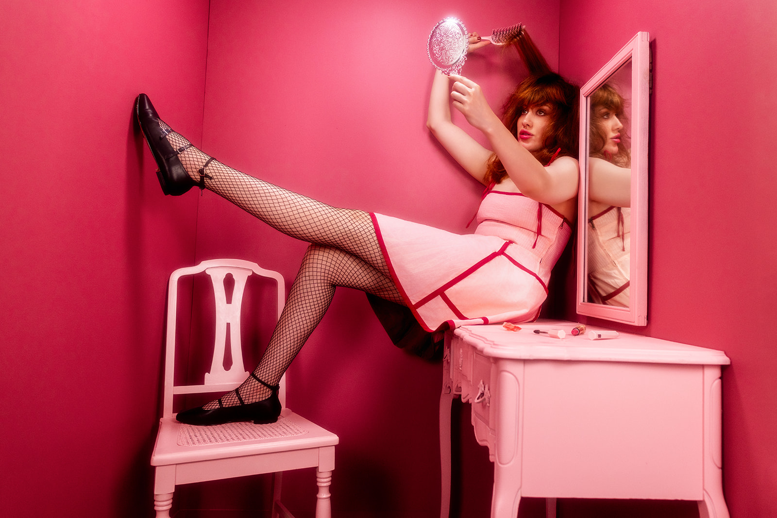
And so it continues! This is Set 5 of The Attic Series.
The Attic Series is a personal project about using what you have and not waiting for perfect circumstances to create the work you want to make. So, we turned our attic into a photo studio and committed to building 25 sets and doing 25 photoshoots inside this space.
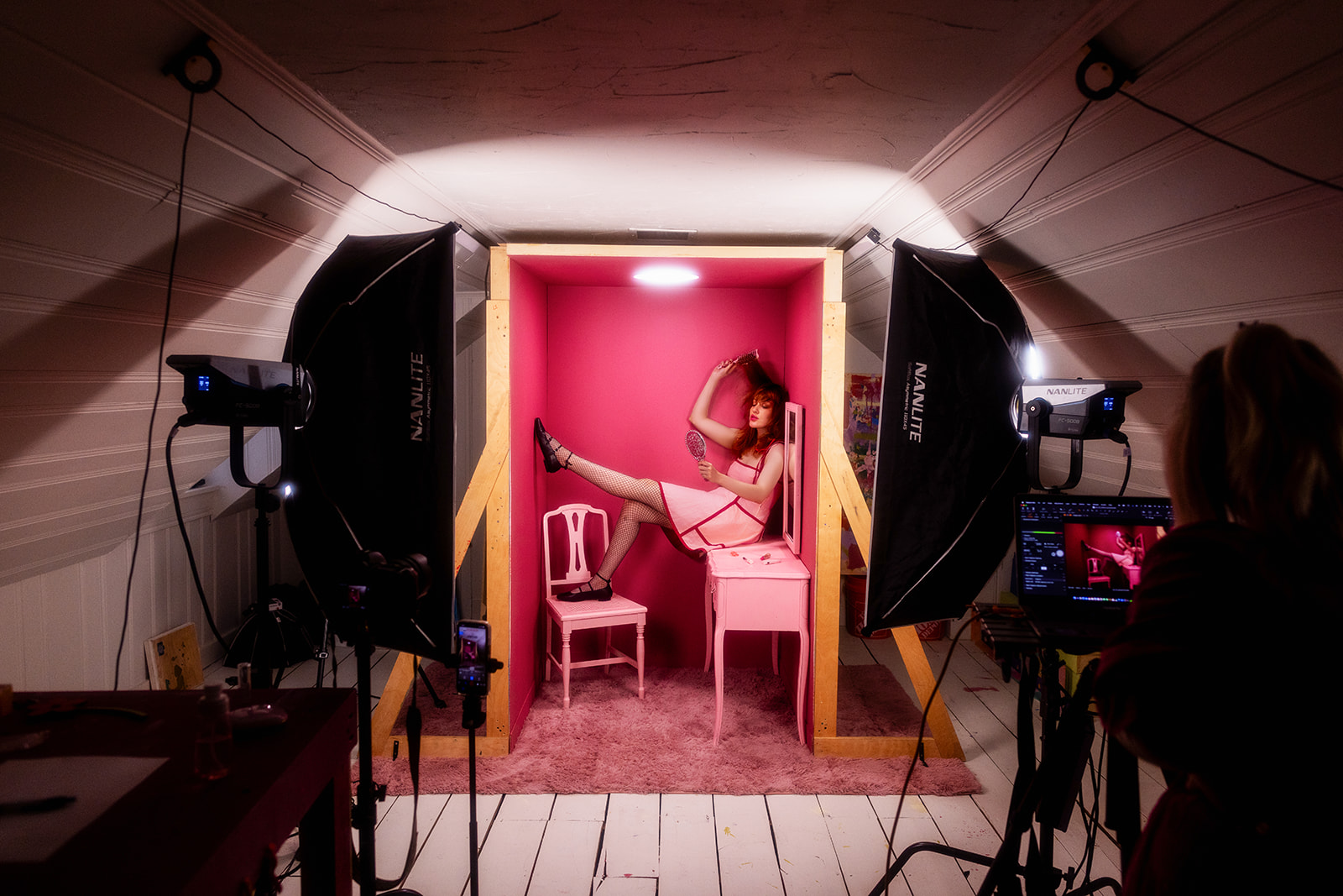
In the spirit of the project, we decided to create a super simple set. All it involved were three flats, a shag rug, a thrift store vanity, and some paint.
Designing a set does not have to be complicated. You can get thrifty.
We titled the shoot “Oh, The Vanity” and used it to dive into that weird space between self love and self loathing. The idea was to play with the line where caring for yourself turns into total obsession, while also exploring what happens when you don’t have enough self-esteem. We really wanted to explore the full spectrum of how we see ourselves.
So obviously we needed to get a vanity.
We headed to a couple local thrift stores in search of a vanity that would become the focal point of the entire set.
There were a few different options, but we ultimately ended up choosing this one because of the soft feminine lines.
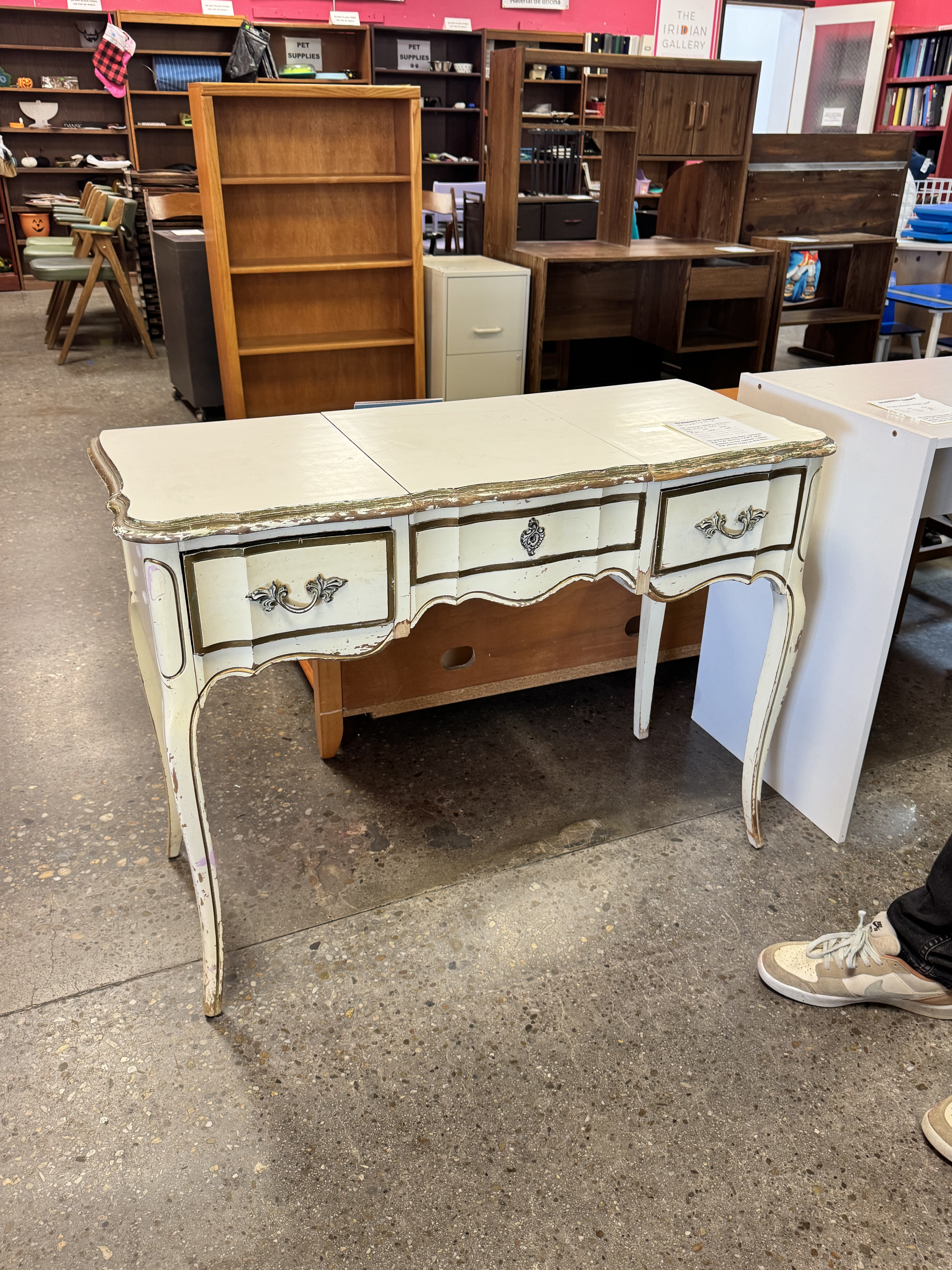
When we first started building sets, David and I used to go thrifting for furniture all the time. What’s especially cool about thrifting is you can find furniture from completely different time periods and architectural styles, which can really add to the impact of a set.
To make the set feel a little more stylized, we decided to create a monochromatic pink room. I love going monochromatic with set design because it’s such a simple way to make everything feel more intentional and visually exciting.
We already knew what outfit our model would be wearing: a pink dress from the brand Alli Mayre. So we color matched the spray paint to the outfit.
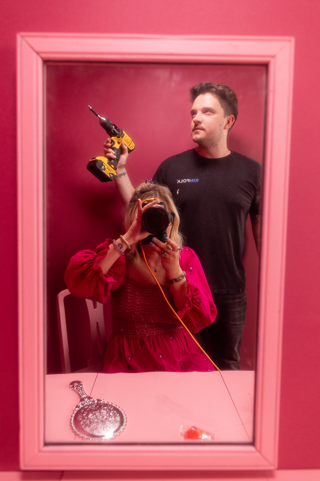
David spray painted the entire vanity, mirror, and chair light pink. Instantly everything looked more stylized and elevated. A little paint can completely transform something.
We purchased a light pink 5 x 7 shag rug off Amazon to serve as the floor of the set. It made the set feel more like a real room, plus it meant less painting for us, which is always nice.
Really the only aspect of this set that required building were the flats. Flats are fake walls that basically act like giant LEGO pieces. You can repaint and reconfigure them in endless ways.
.jpg)
Once you learn how to build one flat, you can build as many as you want and start creating larger sets. If you want to learn how to build flats, David has an entire flat building course that teaches how to build one from start to finish.
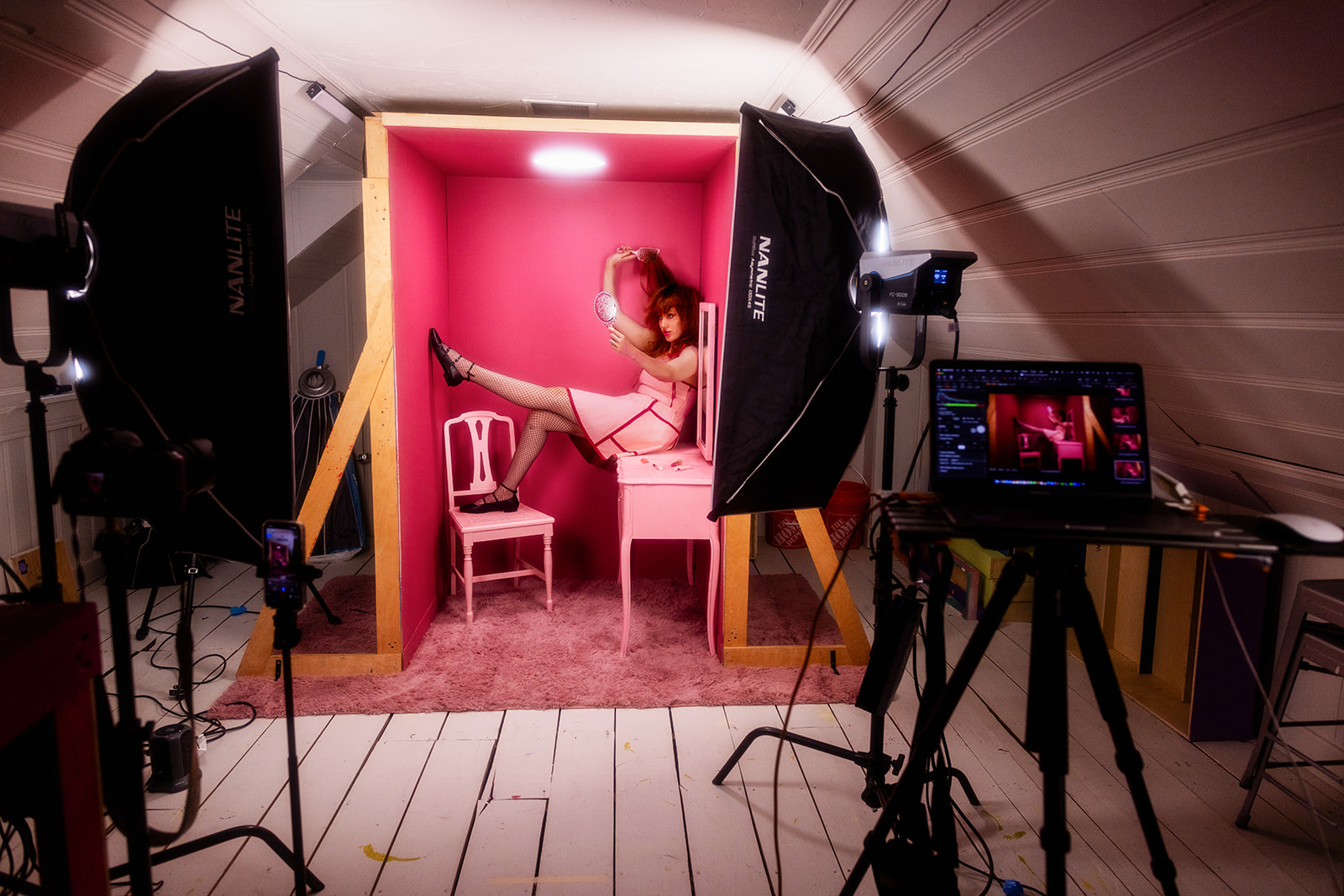
For this set, we configured the flats into a U shape with one back wall and two side walls.
David lit the set with a lot of heavy downlight, which worked really well because he cut a circular hole into one of the flats that made the lighting feel like a practical light fixture within the room.
He used two other lights with strip boxes for a touch of fill light.
I photographed this shoot using a 24mm lens and shot the entire thing handheld. I really liked that focal length for this set because I could get really close to the model while still showing a large portion of the environment. It also allowed me to get full body shots that fully showcased the set design.
I used the Prism Lens FX Rose Filter during this shoot too, which I think really added to the aesthetic of the images. I love the Rose Filter because it softens highlights and skin tones. It made the downlight within the set glow more and gave the images a dreamier feeling that really matched the overall mood of the shoot.
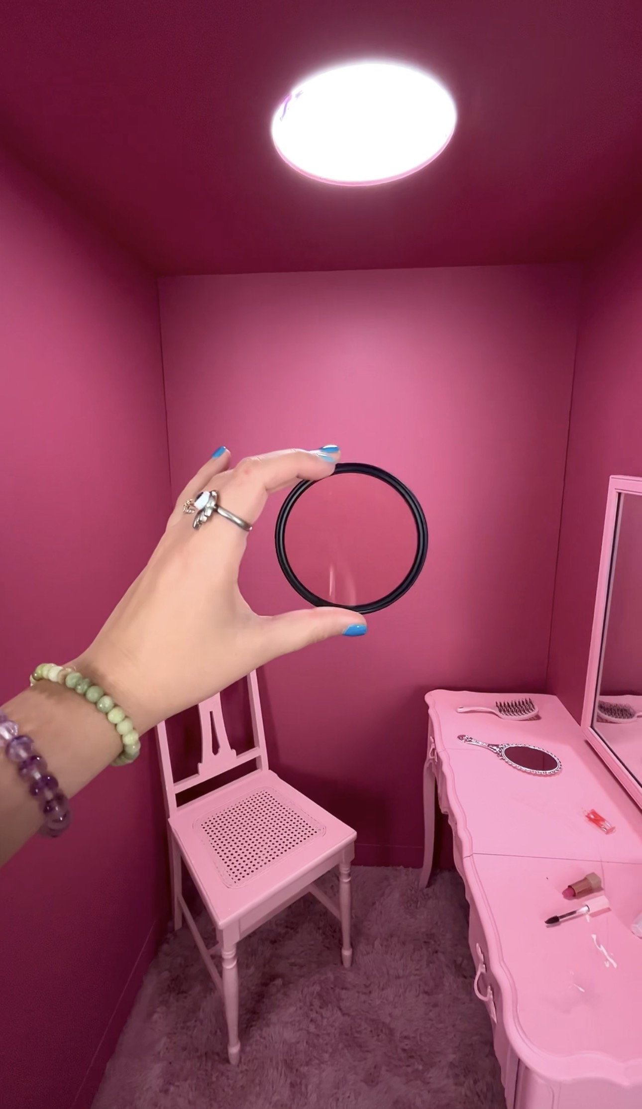
--You can use the code JADAANDDAVID to get 15% off anything on the Prism Lens FX website.
For the props, I went to the dollar store and picked up a bunch of cheap makeup that I could have the model apply during the actual photoshoot.
I started the posing with the model gazing lovingly into the mirror, almost enchanted by her own beauty, while meticulously applying lipstick and mascara.
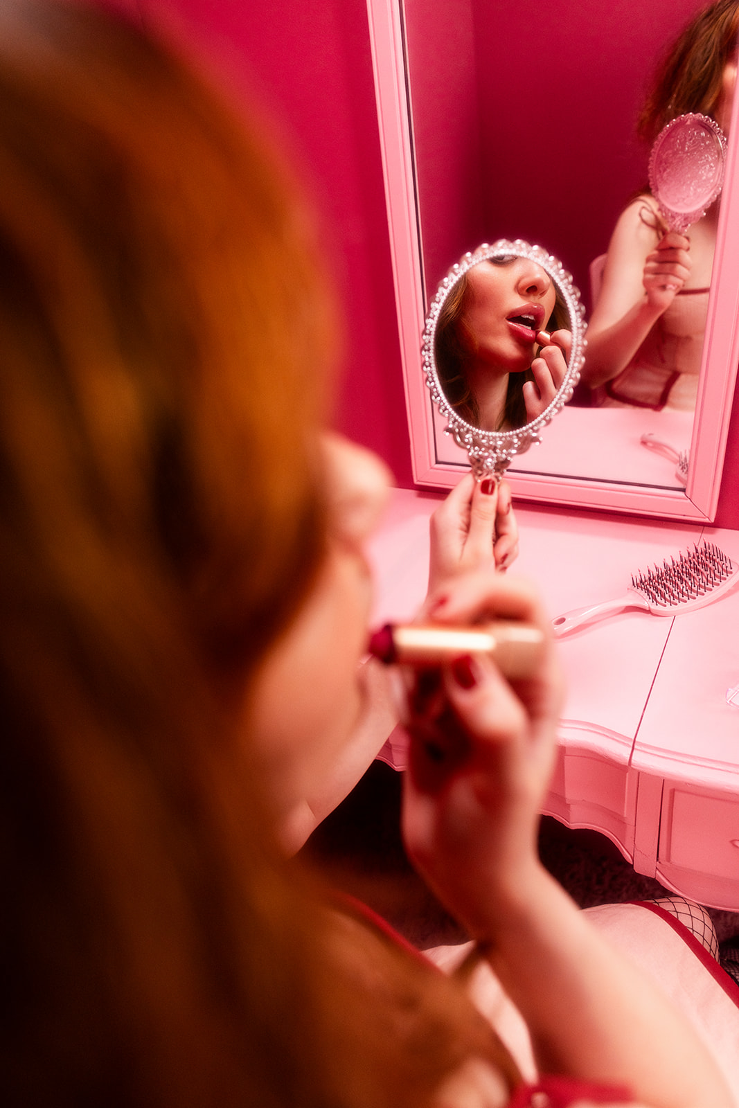
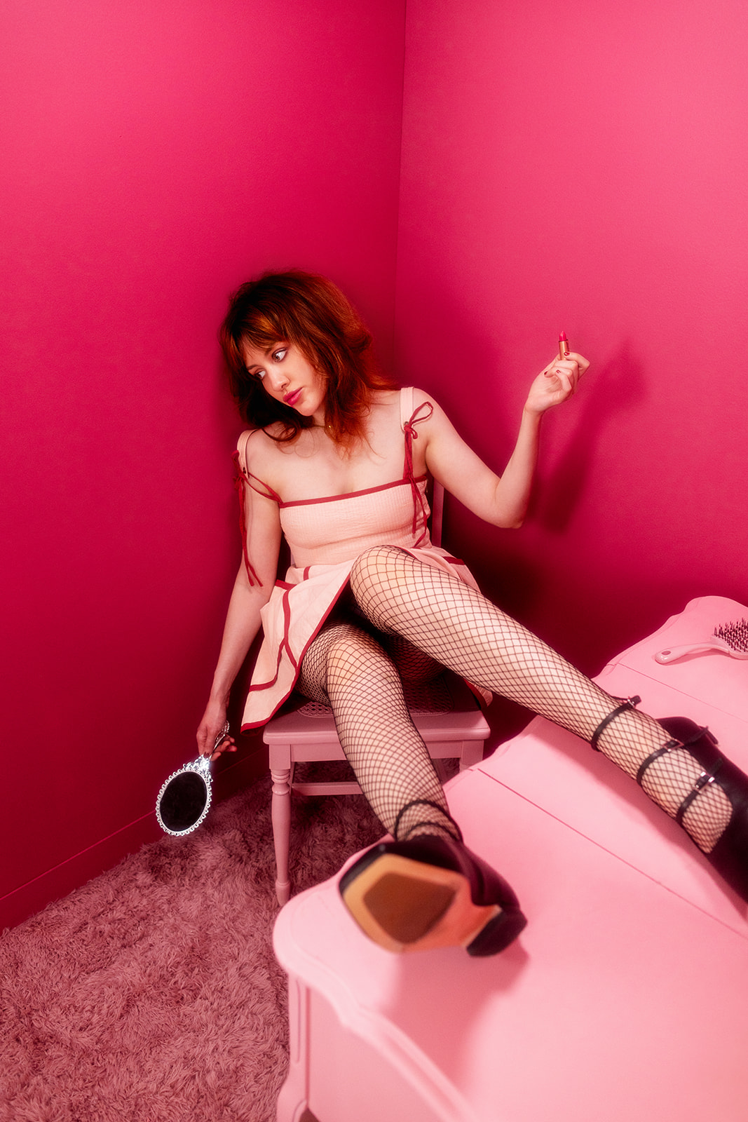
Then we slowly built from there and had her become more frustrated and annoyed as she applied the makeup, like nothing was looking right, until finally she smeared the lipstick all over her face.
I gave her a brush and had her tease her hair up and basically turn herself into a giant mess.
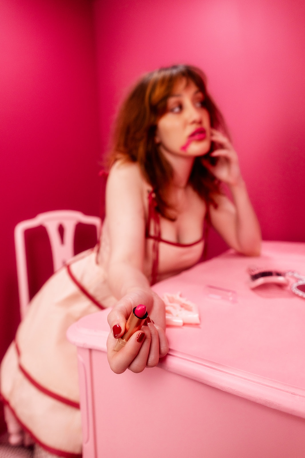
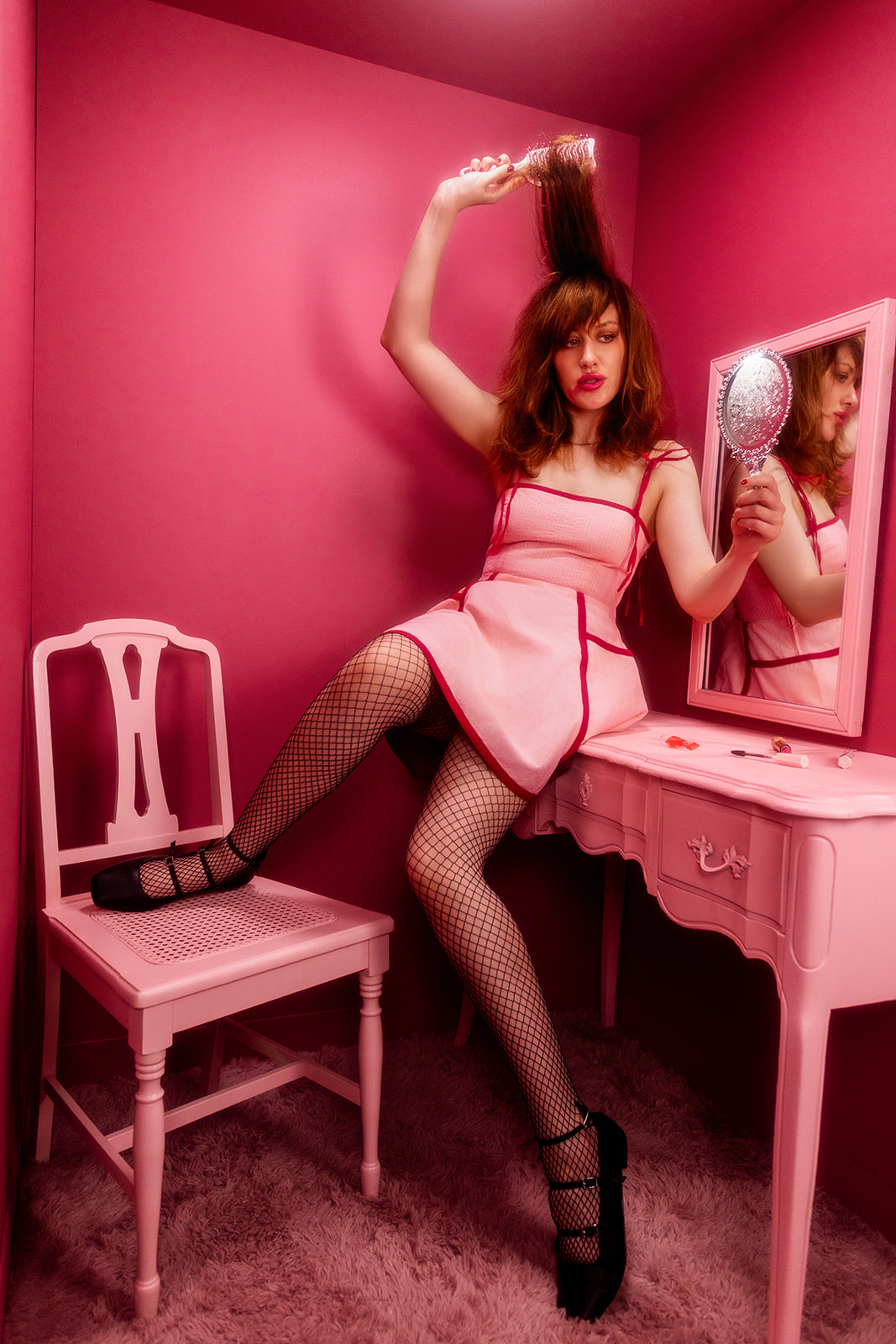
The posing throughout the shoot progressively became more broken and disheveled.
I’m always drawn to photographs with darker undertones and broken posing, so those images really spoke to me. The last few photos from the shoot ended up becoming some of my favorites.
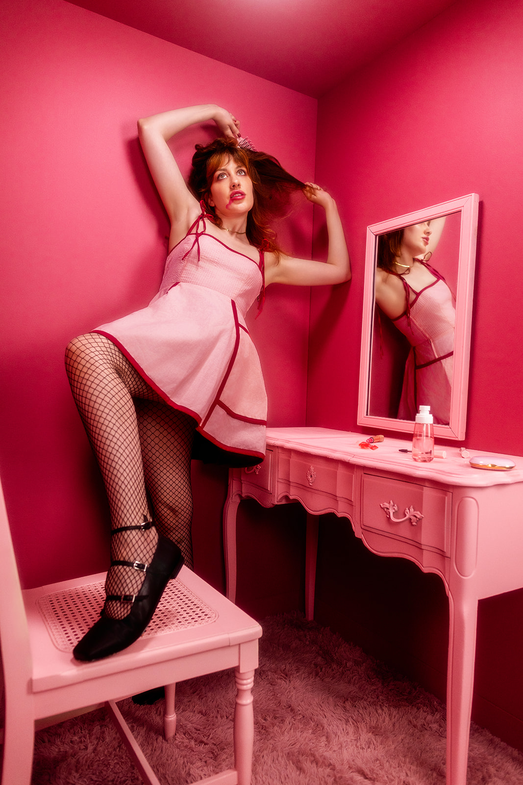
This shoot was a really good example of evelating simple materials. That's one of the coolest parts about photography. You can use super simple materials and through styling ad set design create images that feel high-end.
Check out the behind the scenes YoutTube video to see exactly how we created this set and photographed the shoot.